For years I’ve prodded, encouraged and even begged my kids to keep their food on their plate.
The sight of crumbs all over the table (and sometimes the floor) dropped by over-anxious and/or careless eaters, used to drive me crazy.
These days, I’ve had a change of heart.
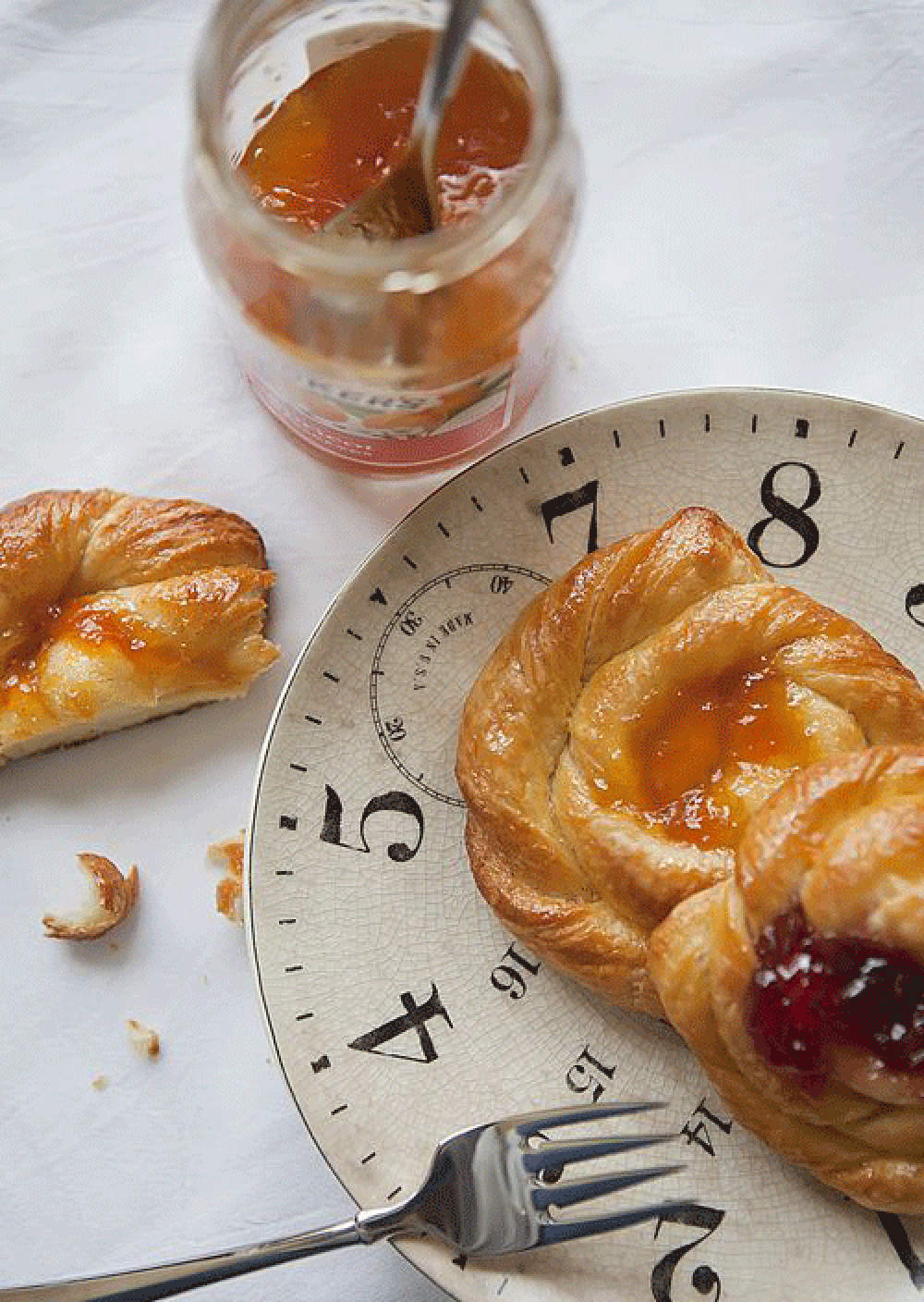
When it comes to food styling and photography, I now welcome crumbs and food around the plate.

One thing you’ll notice about almost all of my pictures of food is that I typically have crumbs or edible particles scattered around the main subject.
Throughout this post, I’ll share a few examples of how the deliberate and strategic placement of crumbs (and food) actually enhances the photo.
Once you start throwing crumbs and food around your plate, you’ll love it.
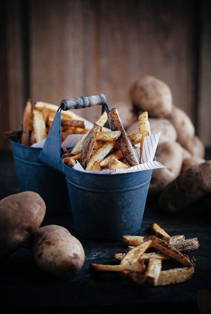
Oh, if you love homemade fries, you’ve got to see how I made these with rustic skins HERE.

When styling food, I try to create a very casual look.
Tossing crumbs lends itself very well to that.
Whatever the main food is in your shot, consider taking elements of it and spreading it around.
In this shot you can get a better feel for what’s in the little copper dish by seeing the contents “outside” the dish.
See what I mean?

You can extend this same principle to non-food items in your food presentation too.
I didn’t sprinkle crumbs here but still pulled elements from the shot (in this case the florals) and spread those around for added effect.
These pretty slices are from a Mother’s Day cake I made HERE.

Here’s another application of scattering and it works especially well when showing ingredients.
Of course, I could have just shared the bowl of melted chocolate but doesn’t this look so much better with the handful of white chocolate wafers?
The wafers may look like they were just-tossed around but they were actually strategically arranged.
You’ll flip when you see what I did with this melted white chocolate HERE.

I touched on this idea a little in my last post on using vintage props when I said the scattering of elements like this create a feeling of movement and immediacy.
The loose flour gives the impression that it was just sprinkled as if I shook the sifter and just stepped away from the table for a moment.
I think this ends up giving your image a more comfortable presentation and that gives the photo a feeling the reader can relate to.
You want it to look casual, random and very natural (even though you as the photographer know that every element in the shot is deliberate).

Even when my shot is clearly more structured and styled you can see in this photo how the addition of extra food around the main subject adds interest.
If the image doesn’t lend itself to crumbs, pull whole pieces out and arrange them.
I liked the idea in this case of using uncut strawberries as errant elements but sliced fruit (as if it just fell off the pavlova) would have looked great too.
You can see more of this recipe in my post on how to make pavlova HERE and you can see more specific photography tips on shooting pavlova HERE.

If something comes out of the oven looking a little “messy”, sometimes it’s OK to leave it as is.
When I first pulled this fruit galette out of the oven, my first thought was to transfer it to a decorative dish.
However, I reconsidered after noticing how toasted the parchment paper looked around the edge of the dessert.
It’s not perfectly neat but it is perfectly real and that works in this shot.
What do you think?

You know that small piece of meat on the pizza wheel is deliberate, right
Looks like I just cut it.
When adding forks, knives (and pizza wheels) to the side of your dish, consider adding a little bit of the edible to the utensil like this to help suggest how delicious the food is.
This technique is especially effective with cakes with icing and other decadent desserts.
Have I made you hungry for pulled pork barbecue pizza? Get the recipe from my earlier post HERE.

Here’s another nod to “strategic” messy.
This dessert was topped with honey but I had a hard time getting the honey to actually show up on top of the dessert.
Well, that’s an easy solution. Drip the honey on the side.
The honey dipper acts as a prop here…. and so does the lightly spilled and spreading honey on the board.
I think once you start scattering, sprinkling and spreading crumbs and food around the plate…. you’ll find it fun but you’ll also take your food styling to a whole new level.
Oh, you can take a bite out of my honey-dripped nectarine tarts HERE.

While my kids still leave crumbs and food around their plates (and the floor) more often than I prefer, I’ve learned to take that in stride.
I guess there are a few things that kids never quite outgrow.
Meantime, when it comes to shooting and styling food, I now know that errant crumbs and food around the plate… are actually a good thing.
A good thing indeed.
Thanks for popping by.
See you back here next time. ♥


Your photos are lovely and I never would have thought about the ‘messy’ elements and how they enhance the photos-
I’d love to know what kind of camera you use- I’m looking for one-
Thank you!
Everything I read about food photography says to toss crumbs around or take some food out of the dish. It looks beautiful and realistic in your photographs. When I do it, it looks like I just threw a dish down in the middle of a mess and started shooting. Practice I guess, right?
Messy but marvelous works great for me! I love the vibrancy of your dark & moody photos. With this quality you actually get a feel for them. I hope that makes sense.
lovely work…!
Your photos are always such an inspiration to me, Lisa!! They are true works of art. I pin these posts to my board – learning photography and photographers I admire. If I need inspiration or am stumped on how to prop I look at your gorgeous photos. Once I get home I’m going to start looking for vintage props. Have a great weekend. Sending big hugs!
This is amazing. It’s a wonderful post. Everything is so gorgeous!
Another beautiful series. I think I put on five pounds just drooling over the exquisite photos!
Spot on, Lisa…love your eye…your photos are intoxicating…perfection while making it look imperfect…just lovely. Each one made me smile. 🙂
You make crumbs look like they should be part of the serving…as if it is not a gourmet plating unless there are gorgeous crumbs and pretties that surround the plate. You may have come up with another popular phrase/question …. “Where’s the crumbs?” … Breathtaking photography as always!!!!
Beautiful photos, as always. I love the clock-face plates. Please don’t tell me they are one of a kind vintage!
I always love your food photos and styling. So beautiful and delicious looking!
Food sprinkles and your lighting are stupendous!
I appreciate that, DeMarie.
I never let good crumbs go to waste-lol.
Thanks so much for popping by and letting me know you enjoy my creative efforts.
Happy day to you.