Welcome to the latest installment of my regular photography series, GET THE SHOT.
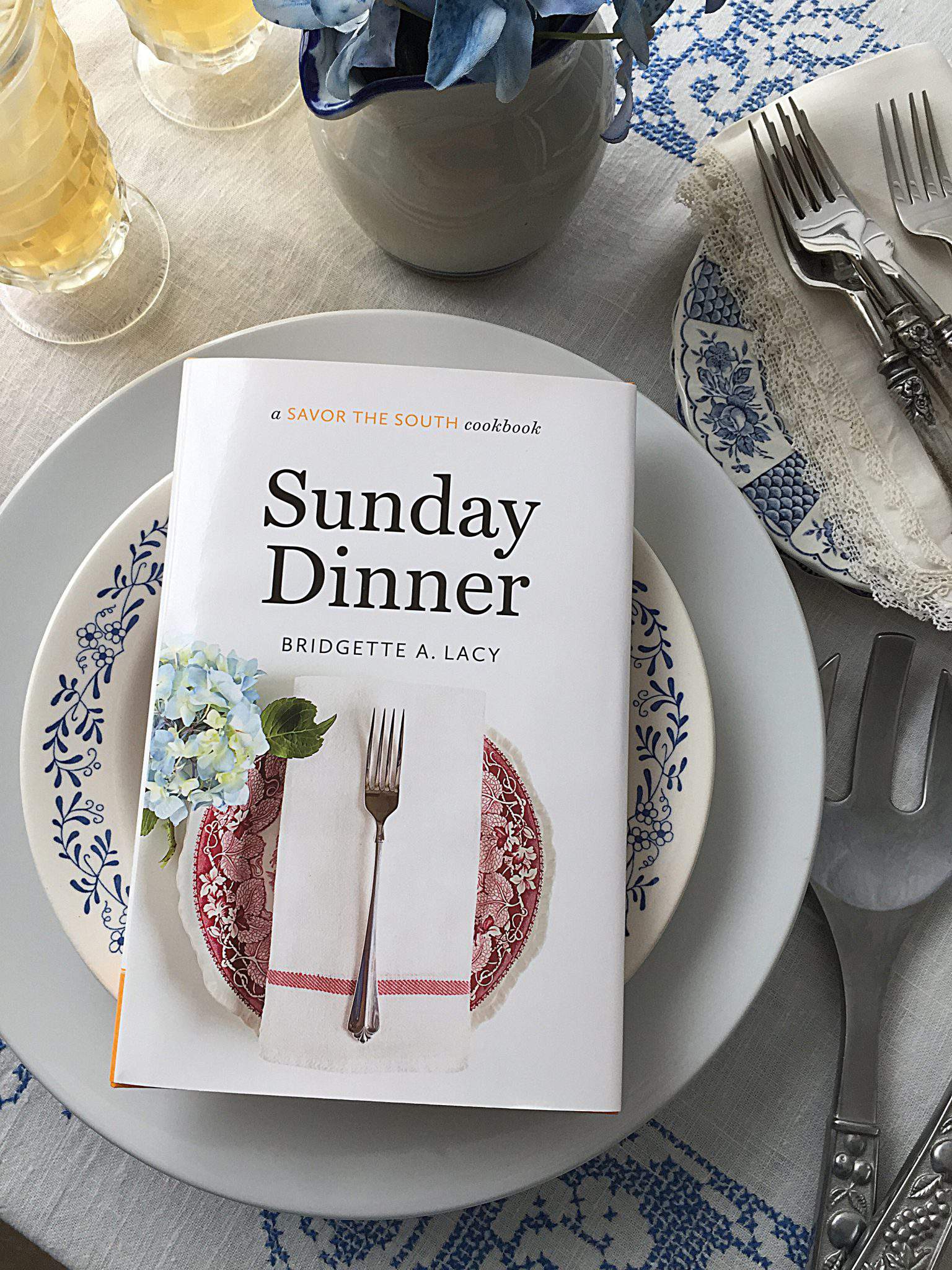
Guess what? I photographed my first-ever cookbook cover and it’s now available online and at bookstores everywhere. Pretty cool, right?
Sunday Dinner was written by my friend, fellow foodie and sweet tea drinker, Bridgette A. Lacy who I’ve known for many years.
Allow me to share the story behind my cover shoot.
I first met the author, Bridgette Lacy more than 20 years ago when we were both news reporters in Indianapolis, Indiana.
At that time, I was working for the local CBS television station and Bridgette worked for the local newspaper.
We covered the same beat and connected over our shared east-coast roots, wild news stories and even crazier, unforgiving work hours.
We’ve been good friends ever since and I’m thrilled she’s realized her long-held dream of writing a book.
Bridgette passed my name and blog along to her editors and last June (2014), I was contacted by one of them who wanted to know if I’d be interested in shooting the cover for Bridgette’s book.
Uh…. yeah!
I immediately started looking around my home for florals and other props to use.
My neighborhood is filled with Magnolia trees and I helped myself to a basket of blooms.
Magnolia blooms are glorious.
They’re just so silky-soft and voluptuous.
Sunday Dinner is part of the popular Savor the South cookbook series which typically features a single ingredient on its book covers.
Due to the subject matter, my cover shoot was going to be a bit of a departure from that tradition and the cover photo needed to reflect that.
I knew editors wanted at least a plate and napkin in the shot so, I turned my foyer into a temporary studio space and started experimenting with different plates, napkins and accents.
Dry erase boards and white poster boards like the ones in the shot above are very useful and help to bounce much-needed light onto a subject.
I’ll talk more about how to use dry erase boards for photography a little further down in this post.
Light can be tricky and finding just the right light for a project can also be tough.
If you’re working with uneven light, consider using a light tent.
These tents are typically made of nylon and can give your subject a more natural light appearance (which can be softer) because the tent diffuses the light on all sides.
When using tents, you can also place photography lamps on either side of the tent to provide even more diffused illumination.
You can find light tents online in a variety of sizes and they’re reasonably priced.
Here’s the finished shot from the light tent.
Out of all the photos I shot for consideration, I actually liked this one the best because of the double napkin wrap and the pretty magnolia bloom which screamed “THE SOUTH” to me.
It reminded me of what you might expect to see on a southern table.
In the end, this shot was deemed too formal.
OK, lets talk more about these large dry erase boards.
These oversize boards also make great backdrops and you can find them at most home improvement stores.
I bought two 32″ X 48″ boards for under $10 each at Home Depot.
Place two of these large boards in a perpendicular position for a great photo effect.
You can see how I’ve used them for other photos HERE, HERE, HERE and HERE.
I switched up the napkins, changed the folds and inserted different flatware dozens of times.
When you take on a project like this, the possible presentations are unlimited.
It’s amazing how a napkin ring or even the small details in the handle of a piece of flatware can impact how the final shot looks.
I tried quite a few stems and blooms too for subtle color and visual interest.
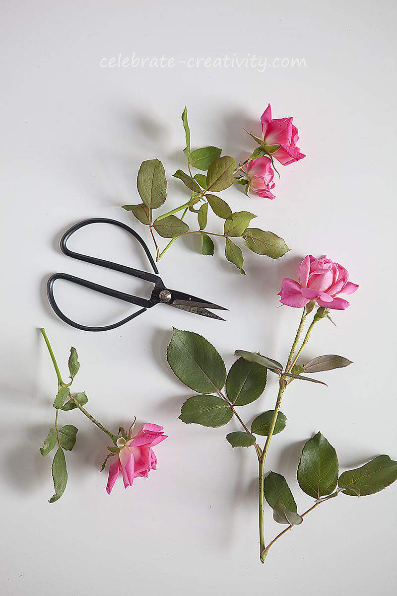
Dogwood, magnolia, roses, hydrangea and forsythia were all strategically placed in hopes of finding just the right arrangement.
I’ve always loved dogwood blooms and this photo below is another one of my favorite arrangements from the shoot.
Ultimately, I ended up styling about sixty different plates for consideration.
I’d say the hardest part of the assignment was straddling the plates to get all these overhead shots. Oh, my aching back.
I’m definitely going to invest in a new tripod with a horizontal arm for my camera so I won’t have to bend over so much for shoots like this.
Do you have a favorite plate from the above mosaic?
Look closely and you’ll see the editors’ pick. The selected photo is sitting in the fourth row, third column from the left.
Here’s the shot with the final book cover typography.
Shooting this book cover was fun and an interesting experience. As simple as the final result looks, you can see how much went into producing it.
Gotta admit, it’s pretty cool to see my photo (styled and shot on my foyer floor) transformed into an actual book cover.
Pinch me. ♥
Thanks for stopping by.
See you back here next time.


Hi Lisa!! Oh my goodness!! Those shots are beautiful. I’m pea green with envy– you are so dog gone talented!!!!!! Should I add a few more exclamation points? And I can’t believe you worked in Indy — I live in Bloomington, IN and today we are headed up to Carmel — hair appointment. Okay, may I pick your brain? I don’t have a fancy schmancy camera and I’m saving up for one — would you tell me what camera you use and your favorite lens? My camera does not have an interchangeable lens but it does shoot in Manuel and the capacity for RAW. I love your photo set up. We are leaving for Saint Simons Island Georgia for six weeks and I do have a challenge with food photo setups. Sorry I’m rambling but once I saw your beautiful photos and that you were once in Indy I got all excited. I’m going back and studying your set up again. Have a wonderful day!
Beautiful shots; great job on the book cover. I also loved the shot of the setting with the Magnolia in the light tent; so beautiful. I have appreciated all of your Photo tips… and have read your blog for a while now. Have a great week.
Blessings,
Pam
Congrats! How much fun to work with/on a project with a long time friend. I really appreciate the photo tips and I found your photo shoot details fascinating! Thanks for sharing~
Jenna
Absolutely stunning arrangements!
how exciting for you – the cover is lovely. I’m a great admirer of your photography (and your many other talents) and it’s nice that you are getting recognized for your work.
Congrads, your photography is beautiful. I always find you so inspiring. How wonderful and special that your first book cover is for your friend.
An amazing achievement! You have one very lucky friend! Thank you so much for sharing the hows, whys and wherefores! I would also like to know which lens you used to capture these shots please! You are an inspiration for sure!
Very interesting and thank you for sharng your expériences.
verO from Switzerland
Wow… thanks for the tutorial. The pictures are awesome! They are all nice…but I have to say my favorites are 3rd Row # 4, 4th Row # 1, and 6th Row # 3.
I love all your posts (even though I don’t comment all the time). You must be thrilled to be the photographer for your friends book. Congrats!
Wow Lisa — that’s awesome! Congratulations — your photos are beautiful — As Always!!!
Such a great tutorial! Love your pictures! 🙂
Dear Lisa, all is wonderful in your blog!!! Greating from Italy, valentina
Love the great ideas and book you share. I’m in the process of decorating my home. Started with my son’s old bedroom it’s now a guest bedroom and redecorated the bathroom. Working on the kitchen.
Oh my goodness! I have that book and I just found your site. Wow, how great to see this post. Your work is fabulous and I think you’re a genius. <3
Thanks Dana for your sweet words. Hope you stop by again.