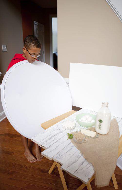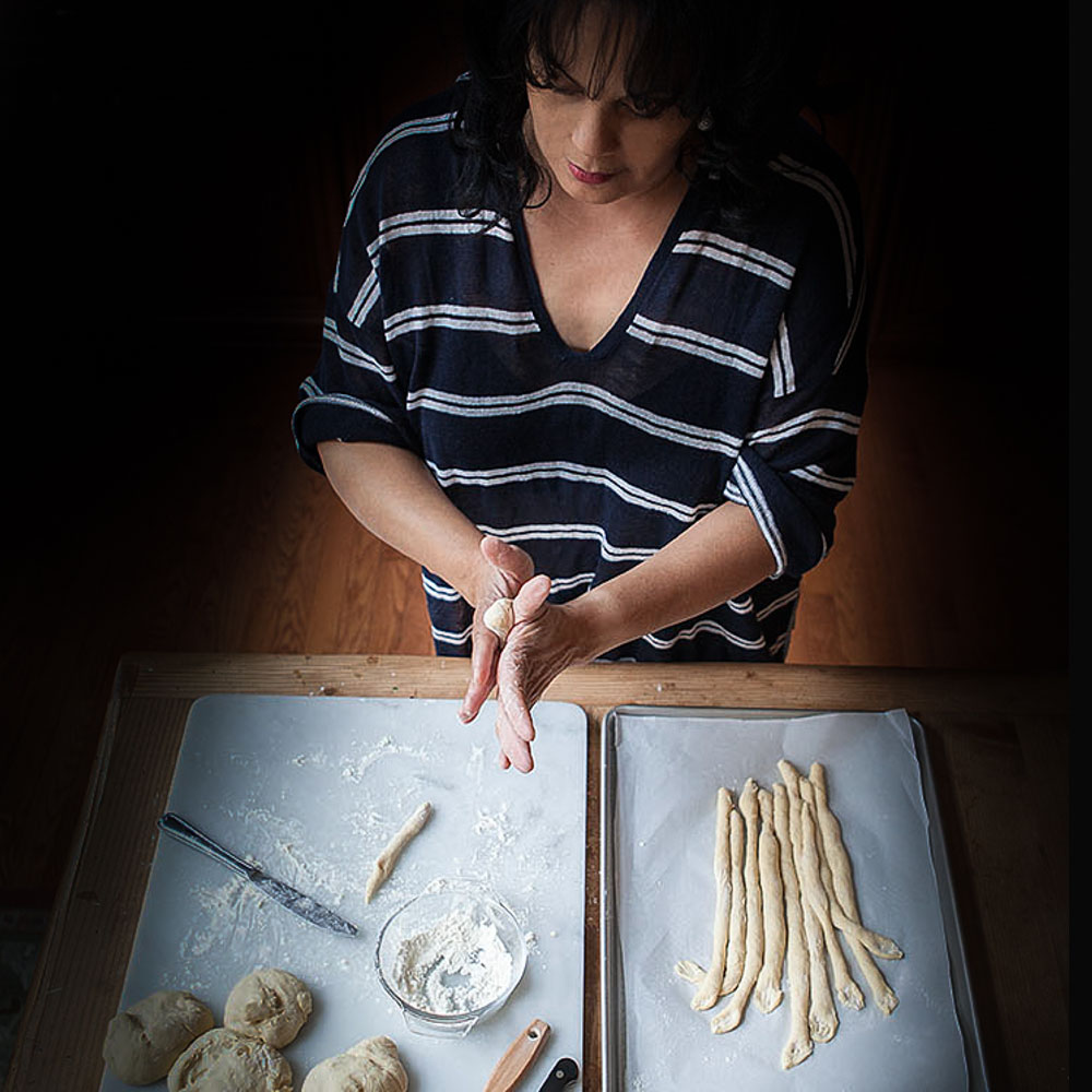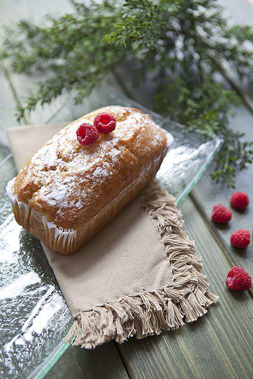
Every food photographer needs a little helper to ensure you get the shot you want.
At the heart of any mouth-watering picture (besides the loyal young helper) is the food styling behind it.
Lately, I’ve been studying food styling techniques as I continue to try to improve my photography skills to benefit this blog and other personal projects.
While you don’t have to invest in a ton of expensive accessories to get great shots, a reflector is a great tool to have in the toolbox.
Reflectors help re-direct light onto a subject in low light or less than ideal lighting conditions.
While reflectors are available in many different sizes, you can pick up a really decent size at just about any camera store for under $40.
I initially picked up these heavy duty clamps to stabilize some wood boards I was cutting for another project but they’re perfect for this use as well.
They’re pretty cheap and can be found at any hardware store.
Throughout this post, I’ll share a few of my favorite books about food styling as well as my current efforts to build upon my knowledge about photographing food.
Regular readers of this blog may recall that I wrote about my cookbook photo obsession some time ago.
In fact, food styling is the main reason I own a ton of cookbooks. I’m less a fan of recipes and more a fan of the photography and the various approaches to creative visual presentation.
I’ve been including food photos on this blog for quite a while. Here’s a quick peek at some of my favorite previously-featured food pix.
You can re-visit the tutorials connected to these yummy photos if you click here.
When it comes to learning about food styling and creating mouth watering photographs of eats and drinks, there are a ton of resources out there.
As I continue to try to improve my own photographs for this blog, there are three books in particular that I’ve been studying.
I found Nicole S. Young’s book, Food Photography, From Snapshots to Great Shots hard to put down because it’s jammed with so much information about styling, Photoshop post processing and more.
Nicole also writes a photography blog called Nicolsy which has tons of useful, easy-to-understand information and tutorials on photography.

I’ve also been studying the techniques outlined in Helene Dujardin’s new book which is entitled Plate to Pixel . Helene is a former chef who turned her passion for food and photography into a successful food styling business.
She’s also the author behind the popular food blog, Tartelette which details her adventures in styling and photography with grand, colorful photos and recipes.

Did you know that in many cases the food you see in magazines/books isn’t really food at all?
Food Styling, a guide to creating your own appetizing art shares lots of trade secrets on making food that is not edible actually look like real food. Of course, this is a common practice in commercial food photography where the food must look absolutely flawless.
There’s also plenty of other good information in this book on styling techniques, tools and photography.

In an effort to start building my food styling toolbox, I decided to make some backdrops.
I started with lumber from my local hardware store. You can purchase inexpensive 10′ and 12-foot planks which can be cut into equal pieces for you right there in the store.
When placed side by side, the boards make a great looking backdrop.
I didn’t apply any paint or stain to these boards which have a rough, rustic texture, almost like they’re from an old barn.
A simple dish of cherry tomatoes look so much more interesting when resting on a wood backdrop.
Once I started making backdrop boards, I found it a little hard to stop at just one set. They’re easy to make and actually fun to transform.
Here’s a backdrop board set I made that resembles an old, worn fence. This aged effect is also very easy to create.

To get this worn effect, I painted the boards brown and let them dry. Then, I applied a layer of crackle solution. Crackle solution can be found at any crafts store in the paint section.
NOTE: I suggest you get the largest bottle of crackle (8 oz. as opposed to 2 oz.) because it’s just more cost effective. Trust me, you’ll want to make more than one crackled backdrop so the extra solution will not be wasted.
Before the crackle was completely dry, I applied a layer of white, acrylic paint and within a few minutes the cracked lines began to appear. It’s a pretty cool process to observe.

I also picked up a several pressure treated deck planks and had them cut down in the store. A 12-foot piece of decking (about $5) can be cut down into four, 3-foot pieces which may be all you’ll need for a small background.
NOTE: Make note of the width of the board before you have it cut. Depending on the width, you may need to buy more than one 10′-12′ plank to build the size backdrop you want. Don’t worrry the extra pieces will not go to waste, they’ll just just give you more size options for your backdrops.
Get more for your buck by painting or staining a different color on the backside of each set to increase the number of backdrops you’ll have to work with.
The top two photos represent boards that were painted with a semi-transparent stain which allows the wood grain to show through. Flip the top sets over and you can see the bottom two sets were painted with a solid stain for a more opaque presentation.
ANOTHER NOTE: Consider covering the stained boards with a clear, non-glossy sealer to help preserve the color and prevent having to re-paint the boards after frequent use.

During daily travels, keep your eyes peeled for unusual looking items that might make interesting props. I found these items in the photo below at a local antique and thrift shop.
I think these are the kinds of items that can add some background character to any item.
I love the look of antique, green glassware and these wooden eggs are an interesting find.
The antique dealer told me these dummy eggs are typically placed under a hen, to encourage her to lay eggs.
Of course, you can’t go wrong with tinted mason jars. I picked up three different sizes.

While in the same antique store, I spotted a young man walking around with this Coca-Cola crate under his arm. When I inquired where in the store he found it, he said it was the only one like it and he offered it to me to purchase instead. Nice guy, huh?
I can’t wait to find a reason to use this vintage crate in a shot.

While I love the look of natural light photography, there is definitely a learning curve when it comes to understanding how to use light effectively. I still struggle with lighting issues but I just keep practicing away.
The photo below was snapped several feet away from a large window.

The shot in the photo below was snapped after I moved the table closer to the same window to shed more natural light on my items.
I also moved the camera lens much closer to the subject so more of my food fills the frame.
While this shot is not perfect, I think it’s much better than the first one.

Sometimes it helps to see a live-view of the scene before I snap it. There’s a setting on my camera that allows me to do this. I don’t use this feature all the time but it’s neat when I do.
NOTE: I was using the same memory card in another camera to take this shot, hence the “no card” reading on the camera screen.
Since the light is different at various times of the day, I find myself moving my practice sets all over the house to find the best lighting source.
Meanwhile, subtle elements can have a nice impact on your shots. Consider the use of burlap. It’s a great fabric to have in your stash. It comes in multiple shades (about $3-5 per yard) at most fabric stores.
As you can see, there’s only a hint of the burlap showing in the final shot but it adds just the right amount of texture to the presentation.
By the way, if you take a small piece of burlap and pull multiple strands (in the direction of the grain) all the way around and evenly, a fringed effect will be created which adds interest to an otherwise plain edge.
Note: These are artificial pears that I recently picked up from Pottery Barn to use as practice items. They can also double as pretty seasonal decor.

Of course, it’s nice when you can enlist a volunteer to help with lighting challenges.
Jordy is always a willing and capable assistant.
It’s fun to experiment with different camera angles. Sometimes that’s the only way to find the shot that works best.
This photo below was snapped with the camera at about waist level.

Here’s the same shot looking down from above the set. I used a step stool to get into position for this photo.
As you can see, the same items with a different camera position creates a totally different presentation.

I’m excited about practicing new techniques, using unusual props and experimenting with post processing software to really take my food photos (and other pictures) to a whole new level.
Photo food fun is challenging but when the shots come out the way I want, it’s that much more of a mouth-watering treat. ♥


I really, really enjoyed this post. So informative and your photos and styling are truly inspirational! Great blog!
Best,
Ellen
I’m so excited about this post that I’m at a loss for words!! You ALWAYS have the greatest post, so informative and inspiring. I wish you much success on your new endeavor, I KNOW you will be great..as always. Thanks for sharing your blessing of craftiness. You have truly been an enlighting inspiration for me. Thanks again:)
I’d better go find the batteries, you’re making this look way too fun, Lisa! GREAT post as always!
Love this post, Lisa! Thanks for sharing this info.
GREAT post Lisa! Thanks for all the tips — especially about the styling books. (BTW, it cracks me up that you buy cookbooks for the photos and not the recipes — you’re too funny!) I love the milk and eggs pictures shot from two different angles. I find myself always wondering if an overhead shot (or a close-up) would look better and I usually can’t decide. Lots to think about here — Thanks!
Lisa, great post! Love all the ideas for backgrounds, thanks!! Such a simple solution, to buy boards! I would have never thought about it 🙂
Delicious post Lisa! I am not really into food styling but I did learn a lot about basic photo techniques in this post. Loved the idea for using crackled wood boards as a backdrop. These techniques can be applied to all sorts of photography!
http://www.mel-designs.typepad.com
I only read a third of your blog when I decided to jump in to post a “thank you, thank you” comment for explaining this subject. You come up with such easy to understand blogs that make me want to go out and buy and go out and try. Thank you Lisa. I am going to finish the rest of your blog now. This is going to be another one that I will read again and again.
Thanks for such an insightful post Lisa, as always you amaze me :)Using Wood planks as a prop base does give that raw ala naturale/organic feel to food. Love it !
Another great post! there is always something inspirational here!
Dang, girl, you’re good! Thanks for the tips and inspiration for photographing!
What a great idea to use boards for a backdrop! It creates such a rustic look.
I am also interested in learning more about food photography. Which of the books that you mentioned do you think would be best for a beginner?
Thanks!
Hi Lisa,
I tried to email you but it bounced and your comment had a “no-reply” address so I’m leaving this reply here. Yes, CCE was incredible and I can’t wait for next year. The LIghtroom course
I’m taking is offered through ClicknMoms. You might be familiar with it
already but if you’re not, it’s a huge photographic community for women and
they offer different classes each month. Another site that offers them is:
http://www.texaschicksblogsandpics.com/lightroom-classes-online/. I know
there are many others, you just need to Google it, then look for reviews.
Another great site to check is Scott Kelby’s here:
http://kelbytraining.com/online/courses/lightroom.
By the way, you have some great stuff on your blog. I really enjoyed the
food photography, lighting and props posts you have. I was so close to
signing up for the food photography class at CCE – wish I had but there were
way too many great classes to choose from!
Have a great day,
Sharon
Great post with wonderful tips! Thank you!
Great post, love the photo’s. Thank you for sharing them 🙂
Stumbled upon this post & ur blog while looking for rewviews for food photography books. This post is great with some real handy tips and u are already so good behind the camera, that I can imagine how better it would get.
BTW I specifically wanted to choose between Nicole’s and Helene’s book, to start my learning. I’m a food blogger who wants to take good pics. Would really appreciate ur advice, since you are amidst few who have read both – Thanks
Every pictures looking great and also that food looking so delicious. I am so excited for eat that food, It sounds like a very testy.
Very amazing photography is done. This all picture are gorgeous. I like this post where I get see this amazing photography of food. I appreciate your work. I impressed by that.
I love this post. I keep telling myself I need to invest in more boards and backdrops. Beautiful pics 🙂
You have truly been an enlighting inspiration for me. Thanks again:)
What a wonderful, informative post! I love using the clips to hold the reflector. Genius! I’ve been meaning to make my own wood surfaces and your tutorial is great. Thanks!
This was such a great read, thank you!
Hey Lisa! I love your photography! It is stunning. What kind of camera and lens do you use?
Hi Cherie, right now I use a Canon 5D Mark II and for most of my food photography I use a 100mm macro lens. I have some more information on my FAQ page that you may find helpful too. Just click the FAQ in the upper right corner of my blog. Thanks for your kind words and for stopping by for a look around.
Such beautiful photos! Thank you for this! I’m always working on my skills as far as a photographer, so I have so much to learn!
Thanks so much Ashley. I have several other posts that center around photo styling and tips in the drop-down photography section in my navigation bar. Just check the Lifestyle and Seasonal category.
I’m still working on my skills too and try to practice as much as possible.
Have a great weekend.
Thanks for all the useful advice! I’m gonna head to the hardware store today and put this info to good use! You’re website and photos are beautiful! Thanks for sharing.
I’m glad my tips are helpful to you, Meg.
Thanks for popping over and letting me know you’re inspired to make a few backdrops of your own.
By the way, you’re handcrafted invitations are lovely and your hand lettering is beautiful.
Happy day to you.
Hi Lisa, what a great and insightful post, thank you! And I just love all the different interests! Love people like that!